Choosing a Print
Choosing the right paper or finish for your artwork is not just a technical decision, it shapes how the piece is experienced. From the soft honesty of fine art paper to the depth of canvas and the striking clarity of acrylic, each option brings something different to the image. Understanding these differences allows you to present your work exactly as it deserves to be seen.
One thing I see overlooked again and again is not the artwork itself, but what happens to it after the upload. We tend to tick all the products, set a markup, and move on… which is absolutely fine from a selling point of view. But from a presentation point of view, not every image belongs on every surface, and this is where you can quietly step in and guide your buyer.
You may not be able to control what someone chooses, but you can absolutely influence it.
Before even thinking about products, take a moment to look at your own work properly. Is it sharp and full of detail, or soft and atmospheric? Does it rely on texture, or on clean lines and contrast? Is it bold and modern, or quiet and traditional? The answers to those questions will usually point you straight to the right finish.
Metal prints are brilliant for anything crisp, high contrast, and full of colour. They make images feel bright, modern, and almost backlit. If you have a strong photograph, a cityscape, wildlife, or anything with real clarity, metal can elevate it beautifully. If your work is soft, muted, or painterly, though, metal can feel a little too harsh, like turning the volume up on something that was meant to be gentle.
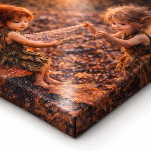
Canvas works in the opposite direction. It softens things slightly and adds that familiar texture we associate with traditional art. Landscapes, painterly pieces, and anything with blended tones tend to sit very comfortably on canvas. The trade-off is that very fine detail can get lost, so if your work depends on precision, it might not be the best match.
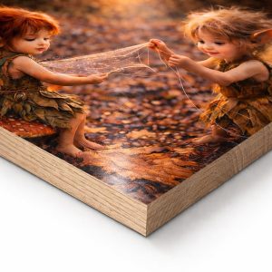
Wood prints bring their own personality into the mix. The grain will always show through to some degree, so they suit images that can work with that, nature, rustic themes, vintage tones, simple compositions. They are not ideal for anything that needs clean whites or exact colour accuracy, because the surface itself becomes part of the artwork.
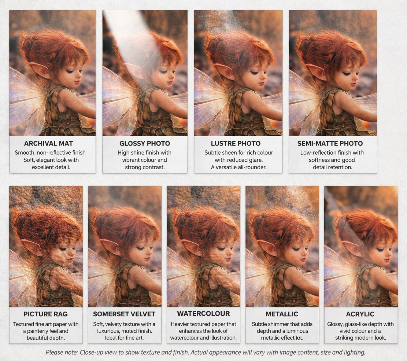
Then we come to paper, and this is where things get a little more nuanced, because not all paper behaves the same.
Archival mat paper gives a soft, non-reflective finish and works beautifully for classic artwork, drawings, and anything you want to feel understated and gallery-like.
Glossy photo paper is your high shine option, it enhances contrast and makes colours pop, but it will also reflect light quite strongly, so it suits bold, vibrant images more than subtle ones.
Lustre photo sits somewhere in the middle, a slight sheen without the full glare. It is one of the safest choices for photography because it keeps colour depth while reducing reflections.
Semi-matte photo leans a little softer again, keeping good detail while toning down shine, which works well for portraits and more balanced images.
Picture rag is a favourite for fine art. It has a gentle texture and a richness that suits painterly work, charcoal, and anything with depth and subtle variation.
Somerset velvet is even softer in feel, almost tactile in appearance. It pairs beautifully with traditional styles and images that benefit from a slightly muted, refined finish.
Watercolour paper adds visible texture and works exactly as you would expect, ideal for illustrations, washes, and anything that wants that handcrafted, artistic feel.
Metallic paper is the dramatic one. It adds a slight shimmer and depth to colours, especially in highlights, making it perfect for striking images, night scenes, and anything with a bit of drama.
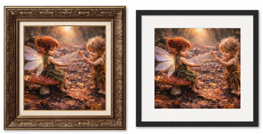
Framed prints are less about the surface and more about the finish. They make life easier for the buyer and can suit almost anything, but the frame itself matters more than people realise. A heavy traditional frame can completely change the feel of a modern piece, and a minimal frame can make a classic work feel oddly cold. The frame is not just decoration, it is the final decision in how the work is presented.
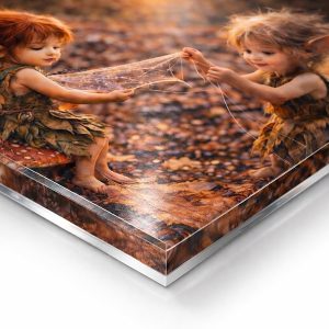
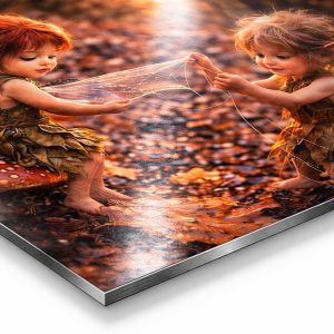
Acrylic prints sit somewhere between metal and glass, and they are all about depth and clarity. They add a polished, almost luminous finish, with colours appearing rich and slightly magnified beneath the surface. If you have an image with strong contrast, bold colour, or anything you want to feel sleek and high-end, acrylic can work beautifully. It is particularly effective for modern interiors and statement pieces. Like metal, though, it is less forgiving with softer or more muted work, as it tends to emphasise sharpness and intensity rather than subtlety.
If you want my honest opinion… acrylic is the one people choose when they want their work to feel a bit luxury gallery, slightly dramatic, quietly expensive.
The real shift comes in how you talk about your work. Instead of just posting the image, start guiding people a little. Something as simple as saying this works beautifully on metal for a modern space, or I would recommend canvas for a softer feel, or best suited to lustre or picture rag to bring out the detail, can make all the difference. You are not limiting them, you are removing that little moment of uncertainty that often stops someone from buying at all.
Most buyers are not weighing up materials in any technical way. They are just faced with options. When you step in and quietly point them in the right direction, you move from simply uploading work to actually curating how it is experienced in someone’s home.
And that, more than anything, is what makes you look like you know exactly what you are doing.
————-
Image used in this post is Repairing A Wing with Briar and Lark

Enjoyed this piece?
Explore more of my artwork and writing, or visit my print store to see available wall art.
Read 19 times so far.


[…] Read the full post on the member blog → […]